This project was UX project working with a real client, in second year of university. The client was a called Good Things Gifts, that specialised in selling ethically and sustainably sourced gifts.
The main task for this assignment was to analyse the User Experience of the Good Things Gifts
website and to redesign it to improve the user experience and increase engagment. There was an
aditional focus on creating content for their Instagram social media page in the lead up to Christmas
Deliverables for this project include:
Fortunately, the client had provided with data relating to their website and social media.
This data included the age, sex and country of the people who purchase their products
and interact with their social media.
It was became clear that the majority of their customers were women aged between 25-35 and second
being 36-45. Reading more online about this demographic gave us a better insight into what they may
want from a website and social media. In addition, we were given access to their social media account
to view their posts and interactions.
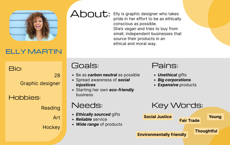
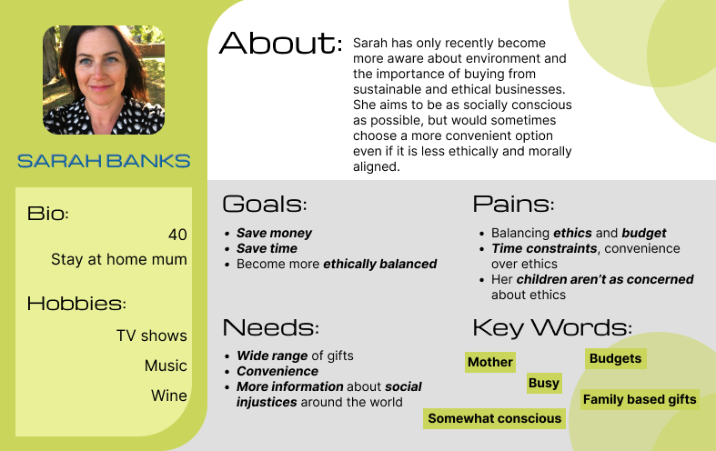
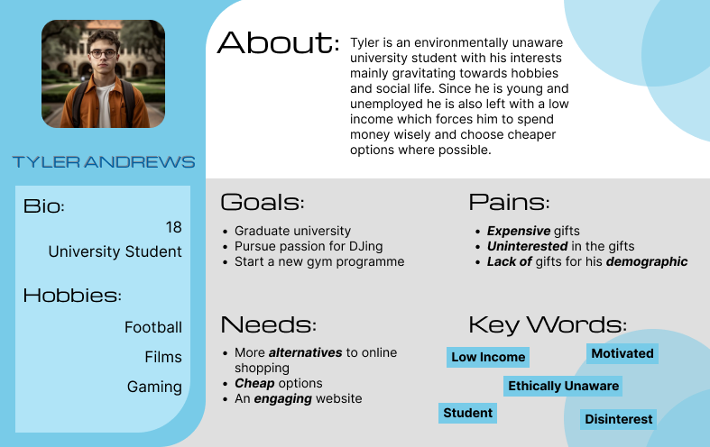
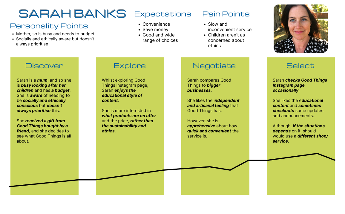
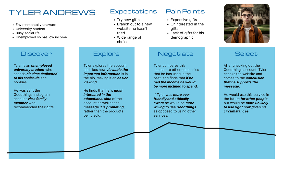
From this we were able to cretae user personas that would be refered to throughout the project.
Three user personas were created for this project, each representing a different person who may or not be interested in Good Things Gifts.
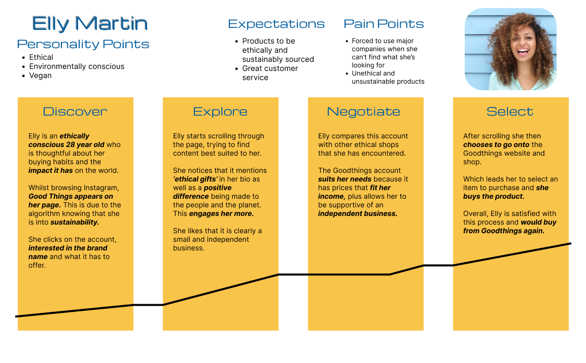
The following User Journey maps go through how each user persona would interact with Good Things Gifts Instagram page. It details what they like and dislike and aims to help better understand and create a social media strategy.
Post regularly, at least once a day if possible
Post reels at least twice a week
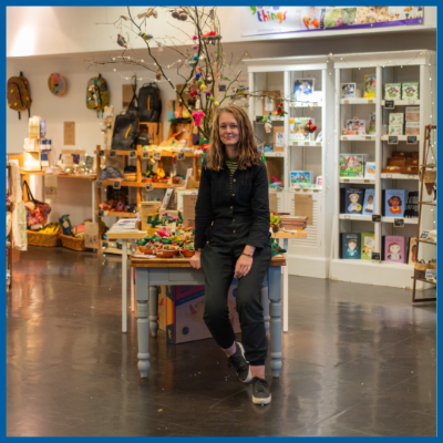
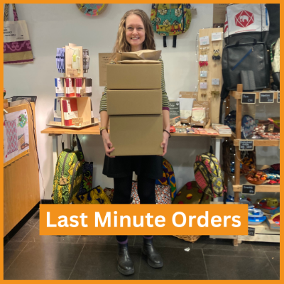
Post with shop owners to show the human side of the business
Posts need to have good and clear branding
On the lead up to December, have posts about setting up the shop for Christmas
In December, have posts that give viewers ideas for Christmas gifts
Work for redesigning the website was focused around improving the User Experience.
We started by conducting observations of user's navigating the website performing
various tasks such as finding a specific product or checking out.
It became clear that the main point of frustration was using the navigation bar.
There were too many options on the drop downs, and users were struggling to find
the type of product they were looking for.
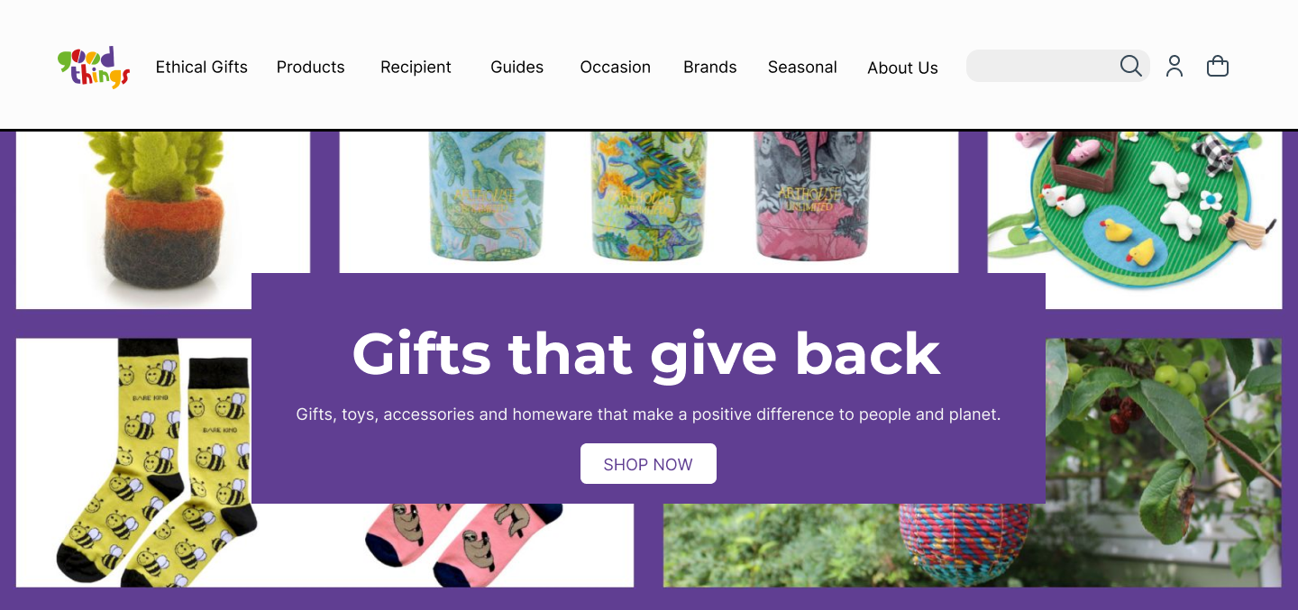
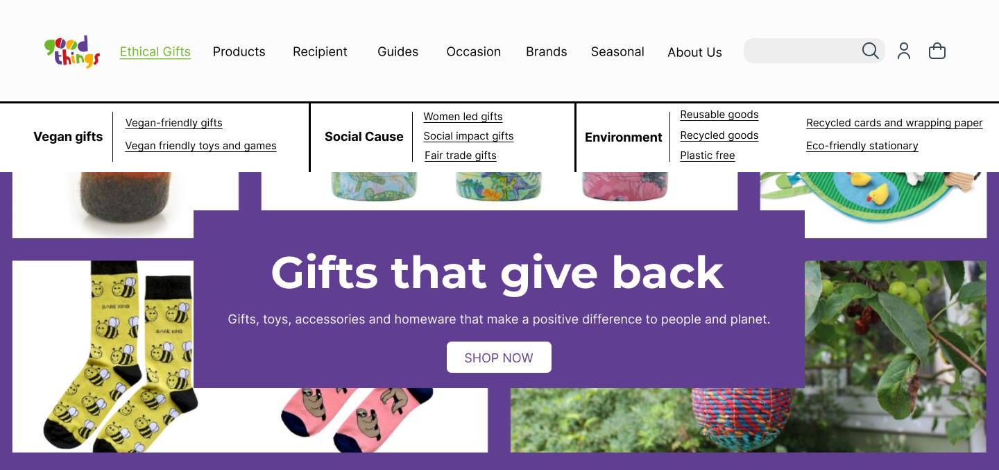
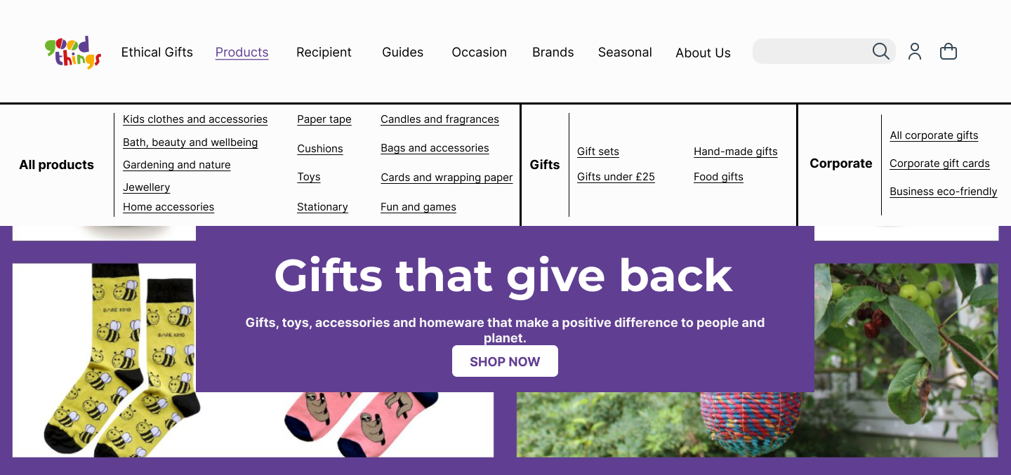
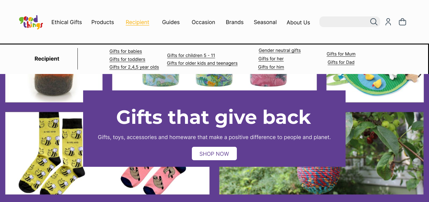
The solution was to simplify the navigation bar. To achieve this, we had users do a card sorting exercise where they would group products into categories that made the most sense to them. This resulted designing a new navigation bar that had more top level options, but each drop down had fewer options and were more concise.
The final design for the website was developed on Figma.